Aegnaer
Seeker
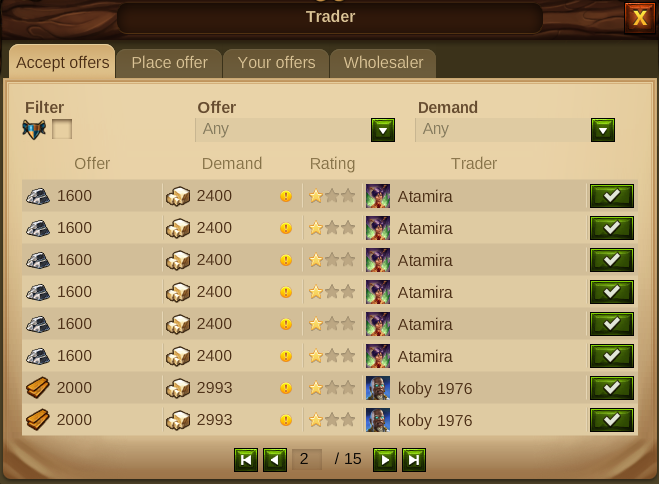
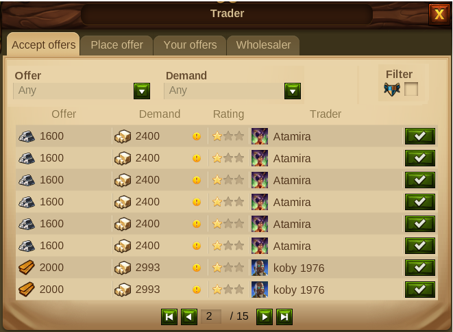
I would like to suggest a small format change to the Trader Screen to improve the user experience. Currently the alignment of the filters for 'Offer' and 'Demand' are offset from the actual list of offers below because of the placement of the Fellowship selection checkbox. With the prominence of the filter text compared to the column headings this can sometimes this leads to confusion as to what is being offered/demanded and thus trades taken in error. By moving the Fellowship checkbox to the opposite side of the screen you can align the filters with the column headers to improve the readability of the screen.
Current Trader Screen

Revised Trader Screen:

If there is room on the screen maybe the Offer/Demand filters and the actual list of trades could be aligned to the same column width which would make it look even better but this small change would be a useful start.
I am sure the Developers can make improvements on my suggested layout but this is just a suggestion which I think will just improve the users experience of the trader screen and avoid those trading errors which I am sure we have all made at one time in our game playing!
Current Trader Screen
Revised Trader Screen:
If there is room on the screen maybe the Offer/Demand filters and the actual list of trades could be aligned to the same column width which would make it look even better but this small change would be a useful start.
I am sure the Developers can make improvements on my suggested layout but this is just a suggestion which I think will just improve the users experience of the trader screen and avoid those trading errors which I am sure we have all made at one time in our game playing!
